The Rotunda, serpentine walls and old style typefaces are all recognizable symbols of the many programs and organizations on Grounds, but the University has never had a unified logo - until now.
The new logo was unveiled during University President John T. Casteen III's State of the University address last week. This design updates Thomas Jefferson's own drawing of the Rotunda, which has a continuation of the roofline dotted into the facade of the building. The new logo replaces the dotted line with 13 stars, representing the first 13 states. It also uses a reinterpretation of an 18th century typeface called Caslon that was used in the first printed edition of the Declaration of Independence.
"It is intended to link the University as the archetype of American public higher education in graphic ways to the republic itself," Casteen said.
"The University is an organization with many distinct departments and operating units," said Leonard W. Sandridge Jr., University executive vice president and chief operating officer. "It is important that these departments and units consistently use a standard logo that is easily recognized as 'U.Va.'"
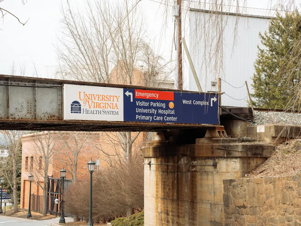
The logo already has been adopted for use by the University administration, the University Health Systems and the College of Arts and Sciences. It will also be used on University letterhead, business cards, vehicles and buses and on signs outside buildings.
"What we want is five years down the road for any prospective student, alumnus, or anyone seeking employment here to see the logo and say 'that's the University of Virginia,'" said Robert D. Sweeney, University senior vice president for development and public affairs.
Architecture school alumnus and New York design consultant James Bell started the year-long process of creating the new logo by contacting the University's communications offices.
He prepared a report that found more than 55 logos used by different schools and departments on Grounds.
The report showed how logo consolidation helped create cohesive visual identities for corporations such as IBM and AT&T and peer universities such as Cornell and Duke.
"Our question was how do we create a symbol that connects best to the University," Sweeney said.
To answer it, the University's communications office assembled an ad hoc committee consisting of members of the administration, faculty and communications officers to discuss the message and formal elements of the logo. They looked to University alumnus and local graphic designer Jim Gibson for ideas for the logo and the final design.
"We wanted a logo that combined the vision of the University and the history of the University," Wood said.
"The design has graphic integrity in the sense that it stands clearly and only for the University," Casteen said. "Yet it offers all sorts of options for schools or departments that want to customize their own letterheads or publications."
The athletic department will retain the use of the crossed saber and block 'V' logos because they already are established brands, Wood said.
"We needed to get a logo that would fit in with the culture of this institution, and link it to the University's core values," Sweeney said. "What we came up with is classic, but powerful, very attractive and conservative"


