If asked to describe myself in one word, it would be this: “anal-about-typography.” Anyone who knows me, or knows me well, knows that if there is one thing in this world about which I am unwaveringly fickle, it is fonts. I am not afraid to voice my opinions about every serif, to scrutinize kerning and to nitpick every descender (a descender, in layman’s terms, is the portion of a letter that extends — or rather descends — below the baseline of lowercase text, such as in the lowercase letters g, y, p, j and q). And when it comes to my own font preferences, I am unabashedly a hardline traditionalist, which is to say I use Times New Roman.
There is a scourge, however, that is invading our word processors, our emails, even some of our most important documents. No, I am not referring to the infamous popularity of Comic Sans. Nay! The often overlooked problem to which I am referring goes by a far more unassuming name: Calibri (as well as its cousins Helvetica and Arial). All of their names connote something mysterious, even exotic — roots in some ancient Romantic language. No suggestion of their true, unbearably pedestrian appearances. But beyond their pompous, elegant titles, this unholy trinity is nothing short of a disgrace to any language they are used to express.
The problems of Calibri, Helvetica and Arial are numerous. To begin, they are sans serif, lacking any sort of ornamentation. Since the dawn of language itself, pride was taken in the creation and selection of fonts — any illuminated manuscript is proof enough of this claim. The creators of Calibri, however, could not be bothered to add an extra line to the top and bottom of the “l,” or to vary the line size in the “o.” These fonts reflect no existing handwriting or common print — the kind that is easily found in any newspaper or novel — positioning them in a sort of limbo of artificiality, an “uncanny valley” of typography, as it were. This was of no concern to the architects of Arial. And unlike Comic Sans (or other frequently-mocked fonts like Papyrus) brazen in its ridiculousness, the rigidity of these fonts is such that they are suited neither for a professional nor an informal setting.
Despite all these seemingly-glaring atrocities, Calibri, Helvetica and Arial have become not just popular, but the default fonts in Microsoft Word, Pages and Google Docs, respectively. And I am ashamed. As someone who loves and respects fonts and their creators, it saddens me that such mediocre typefaces have become so ubiquitous. At the risk of sounding grandiose, font is art and the people who create font, artists. Such was the case even before the dawn of printing when books were carefully copied by hand, for hours or days; when love and respect and care were taken with the noble work of font creation. Perhaps my stalwart conservative views on typography are clouding my judgment. But perhaps my weak words, likely printed in Times New Roman, have struck a chord with some of you who until now were content to settle for the default fonts; for the Calibris and Helveticas and Arials. And to you, dear readers, I say thank you. And try Times New Roman. Or at least Garamond, or even Georgian. Just not Calibri.
Read More
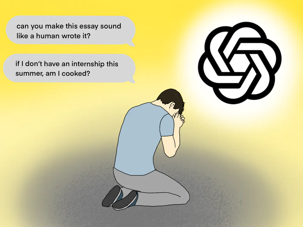
Data Analysis: The most common questions U.Va. students ask ChatGPT
By Sofia Cooper | 2 days agoHere are the five most frequently asked ChatGPT prompts circulating on Grounds.

You violated the honor code — and honestly, that was brave of you
By Scarlett Sullivan | March 18, 2026Using me, ChatGPT, to write your ENWR essay in full is an honor violation in itself. But you also accidentally copied and pasted the prompt you gave me into the first and final “draft” you submitted to your professor. That’s serious.

Career Center to host ‘LinkedIn Looksmaxxing’ advising series
By Natalie Boucher | March 12, 2026Inspired by a wave of internet discourse, the Career Center will be hosting workshop events to assist students in making themselves more attractive to employers.