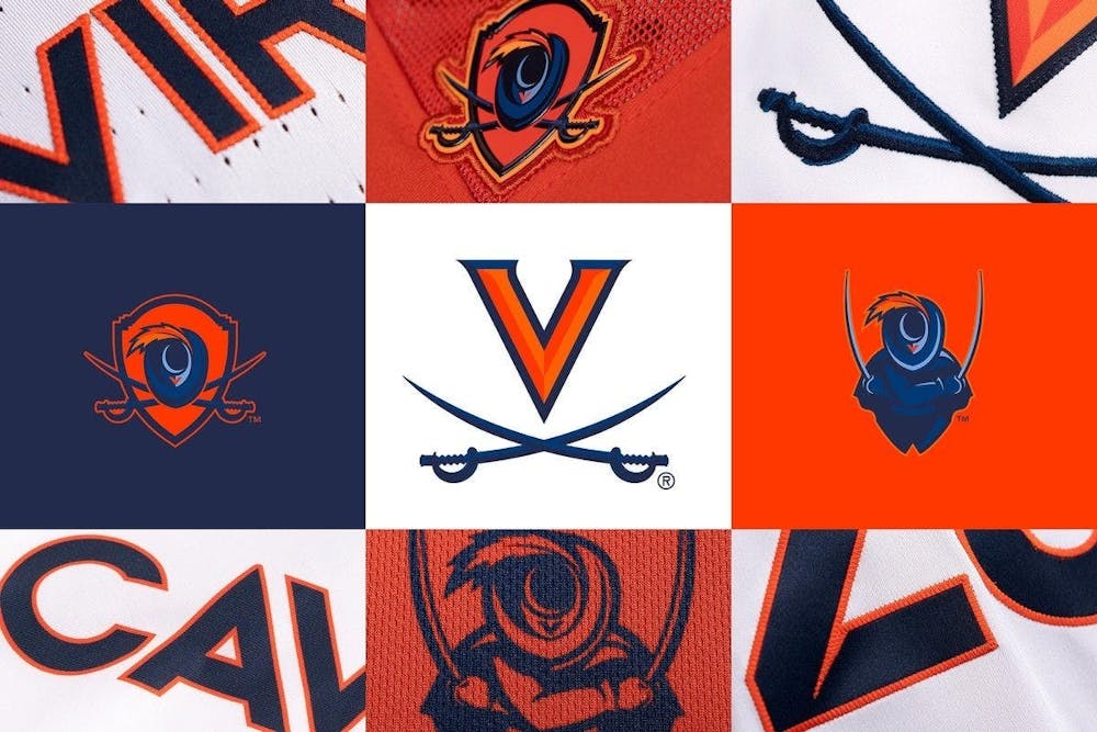
About a month ago, Virginia Athletics unveiled a brand new visual identity system including updated marks and typography.
“Eighteen months ago, the athletics department began an ambitious project to evolve and strengthen our visual identity,” Virginia Athletics said in an email to The Cavalier Daily. “The new V-Sabre logo was designed to be more visually dynamic, particularly when placed side-by-side next to other school logos. Another goal of the project was to add secondary marks and, in particular, to create a mascot logo that was representative of all Cavaliers.”
The new branding has garnered both positive and negative reviews from the general public. To understand a more nuanced perspective, The Cavalier Daily spoke to Tim McDaniels and Rob Wooten — a pair of branding professionals with a combined 35 years of experience in design and development.
McDaniels and Wooten are both partners at Convoy — a branding, print and interactive design studio based in Charlottesville — which has developed logos and designs for a variety of local clients ranging from the Charlottesville Tom Sox to the U.Va. Research Park.
Given their experience and expertise, McDaniels and Wooten had many thoughts regarding Virginia’s new visual identity. First and foremost, both agreed that the refreshed primary logo — the V-Sabre — benefitted from its new enhancements.
McDaniels, Convoy technology director and founder, described the new primary mark as “slick” after the subtle changes — bolder lines and thicker sabres — were implemented. Convoy Creative Director Wooten added that these modifications addressed functional problems, improving the logo’s legibility at smaller sizes.
“I didn't see much of a difference,” McDaniels said. “I noticed the bevel, I noticed that the sabers were more detailed, but ultimately, I thought it was a cleaner version of the traditional V-Sabre logo.”
Compared to the primary logo, McDaniels and Wooten were far more critical of the secondary marks — the Cavalier Shield and the Virginia Cavalier — that were introduced. According to David Martel, vice president for communications and chief marketing officer, it’s typical for colleges to couple a primary athletic logo with supplemental marks to “create added variety, uses and interests among fans and student athletes” and provide “more flexibility and creativity across social media platforms.”
“The V-Sabre will continue to be featured as U.Va.’s prominent athletic logo on uniforms, on the 50-yard-line of Scott Stadium and at half court on [the] floor of John Paul Jones arena,” Martel said in an email to The Cavalier Daily. “The new secondary marks — the Virginia Cavalier and the Cavalier Shield — are intended to be used as detail graphics on uniforms, on social media and on apparel.”
Martel also highlighted specific examples of the benefits of adding the secondary marks. He explained that the new marks — particularly the revamped Virginia Cavalier — have been popular in student-athlete recruitment. He was further impressed by the Virginia football staff’s use of the new marks on social media.
That being said, both McDaniels and Wooten emphasized that the new marks were confusing and muddled.
“There's just too much going on here to tell a quick visual message,” Wooten said.
With so many colors and elements, like multiple shades of blue and a feathered hat, McDaniels and Wooten agreed that the secondary marks were difficult to understand.
“In a lot of ways, the secondary logos are just too complicated,” McDaniels said. “I think what makes a great logo is simplicity, and [the secondary marks] are not simple. I'm not sure how great they will look on merchandise.”
Wooten also said that the visual cues included in the logos — the Rotunda’s roof can be seen in the shape of the shield and the serpentine walls in the sabres’ handles — added little value given that few would even notice these subtle details on their own accord.
Besides the secondary marks’ complexity, McDaniels and Wooten also criticized the logos’ cartoon-esque aesthetic. According to McDaniels, the animated appearance doesn’t fit Virginia’s culture. Wooten added that the “trendy” style isn’t ideal for a sports logo.
“I think [the cartoonish style] doesn't work for sports teams because sports logos are supposed to be very simple and iconic,” Wooten said. “This is very layered, there [are] a lot of elements. This feels like a comic book illustration.”
Wooten elaborated that this design style is becoming increasingly common due to modern advances in technology and tools which make stitching complex visual elements on clothing possible.
In addition to Virginia’s secondary logo designs, McDaniels didn’t agree with how the new branding was unveiled. Even as an avid Virginia basketball fan and follower of several Virginia news sources, he wasn’t aware of the new logos before they were officially released and believes that the “abrupt” unveiling “took everyone by storm a little bit.” McDaniels thought that Virginia Athletics could have let the community know in advance that a change was being made and give fans the opportunity to prepare themselves while also building up excitement in the process.
“I would have just done a little more [public relations] by maybe doing a soft release with the primary logo first, and not releasing everything at once,” McDaniels said. “Maybe three months before the unveiling, I'd let the public know that this was happening, because I think a lot of people were surprised that this was happening at all.”
While McDaniels and Wooten may disagree with many of Virginia Athletics’ choices, both acknowledged that the process of designing a new brand identity can be very difficult for a few reasons.
First, they explained that developing a brand for a large organization like Virginia requires satisfying several different stakeholders ranging from coaches to students to alumni. With so many competing ideas, it’s virtually impossible to please everyone.
“The best way to [address multiple stakeholders] is really by doing research from the ground up,” Wooten said. “You need to ask questions to everybody that's in the audience that's involved.”
Second, Wooten noted that working with a global brand like Nike can also be problematic. According to Martel, Virginia Athletics partnered with Nike’s Global Identity Group to develop the new logos at no additional cost and as part of its current contract with Nike. Notably, Martel elaborated that “Nike's research, discovery and design processes involved consulting student-athletes, coaches and staff from the initial stages of the project through its completion.”
However, it's unclear how effective these processes were given mixed community reactions regarding the designs.
“[Nike isn’t] located in Charlottesville, and there is a disconnect with alumni and day-to-day fans,” Wooten said. “Their knowledge of college sports is more broad and less focused on a specific brand like U.Va.”
Third, McDaniels and Wooten highlighted the fact that oftentimes these types of brand updates naturally receive a negative response at first due to the community’s loyalty and devotion to the previous identity.
“The thing about these established historic sports teams is that, a lot of times, they're like religions to people and they take them very seriously,” Wooten said. “Trying to change a logo or any type of imagery can be just as difficult as redesigning the cross for a church. You're going to get some pretty visceral reactions about it.”
That being said, Wooten did acknowledge that “over time, people learn to accept [new branding] and sometimes ultimately love it,” meaning that despite some initial negative reactions, the Virginia community could eventually embrace the new logos once it has time to familiarize itself with the marks.
Conversely, McDaniels suggested that the secondary marks “will probably be phased out” and eventually “fade away,” similar to past Virginia mascots like "'Lil Hoo.” McDaniels further elaborated that Virginia Athletics has a track record of listening to the community, which could lead to future modifications.
As an example, McDaniels explained that the iconic V-Sabre logo design is unique in that it wasn’t initially created by Virginia. In fact, the logo was designed by Matt Welsh — son of legendary Virginia football Coach George Welsh — in the mid-1990s and was later adopted by the University.
“[The original V-Sabre logo] was created indirectly by a coach's son, and the logo immediately became a fan favorite,” McDaniels said. “It took years before U.Va. Athletics embraced the logo … This history also shows that U.Va.’s athletic department hears the voices of alumni and fans and will likely use the reaction to make changes in the future.”
Virginia Athletics did not address mixed community reaction to its new visual identity in its response to The Cavalier Daily.
Regardless of what happens in the future, both McDaniels and Wooten agree that Virginia Athletics’ new logos seem to have missed the mark. While the updated V-Sabre mark is functionally better, the secondary logos are not only uninspired and confusing, but also don’t fit Virginia’s collegiate culture.
“At the end of the day, I didn't think anything was wrong with the U.Va. sports brand,” Wooten said. ”When it comes to creating these marks, there’s just certain emotions and aesthetics you have to remember. They have to be iconic and they have to be fun and they have to have personality.”
Read More

No. 6-seed Virginia women’s golf parades to the NCAA Championships
By Sofie Keppler | 2 hours agoIn the program’s fifth straight season, Virginia women’s golf has forged past the regionals to the NCAA Championships. This season marks the program’s 16th championship berth in 23 years.

Ahead of postseason play, evaluating Virginia baseball’s odds
By David Sewall , Xander Tilock and Joe Schwiesow | 23 hours agoAs the Cavaliers’ season reaches its conclusion, three beat writers break down the good, the bad and the ugly ahead of a critical road trip versus Louisville.

Better, not harder: spending a morning with Virginia women's rowing
By Eleanor Lynch | Yesterday“I like that finish on Ava,” Ruden said quietly in the launch. Seconds later, Coach Ng's megaphone carries the validation to the boat, “Ava, we like your finish.”